Transport Results
After the optimization has been completed you can analyze the results using various tables, bar charts and maps. On this page you can find reports of the results related to the Transport category, such as:
You can read about the period selector in Period Selector.
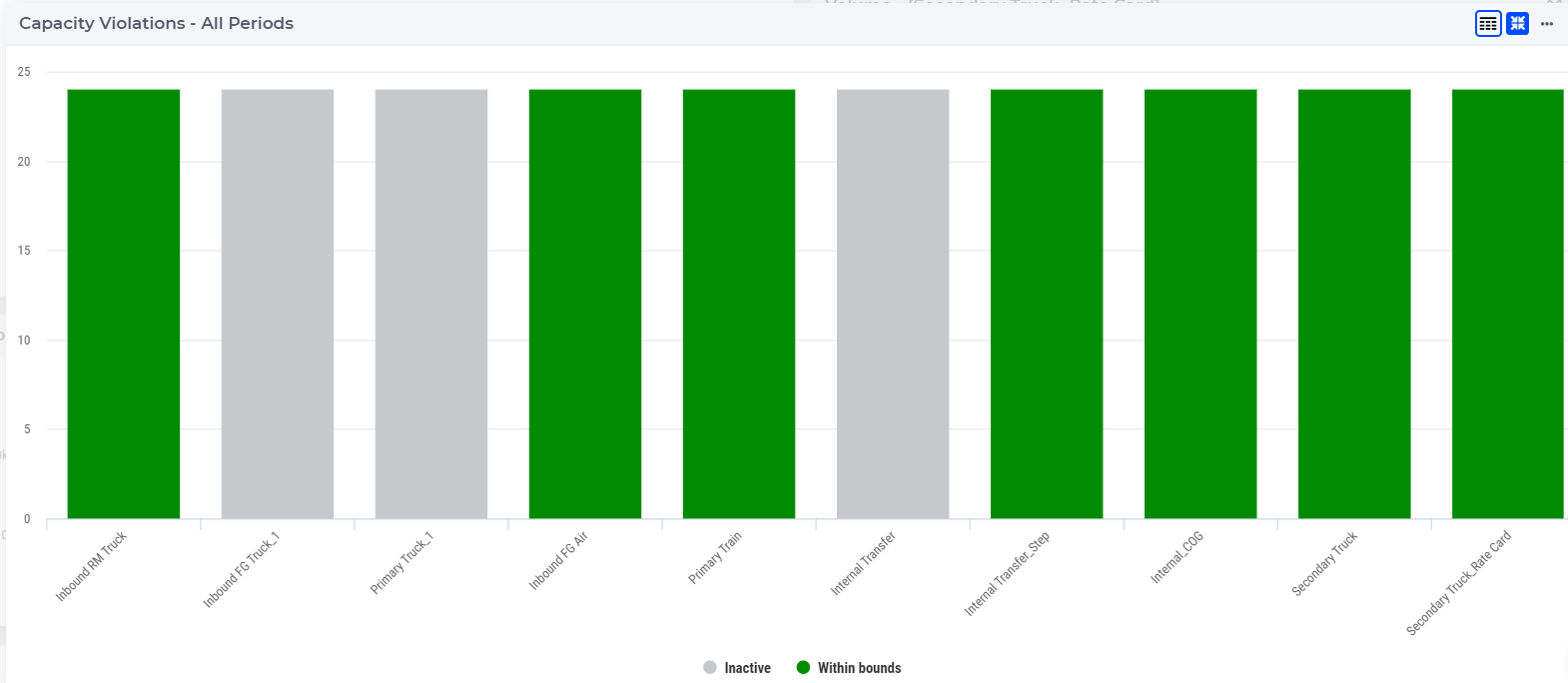
Transport Capacity Violation Bar Chart 
This bar chart shows the capacity violation for all periods and for all transport modes. The name of the transport mode is shown on the x-axis and the number of periods is shown on the y-axis.
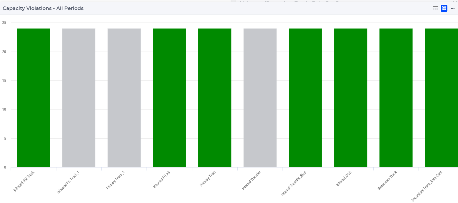
The bar chart is color-coded based on the status of the transport mode, which can be one of the following:
Red (Violated): when the capacity utilization is higher than its limit
Orange (Near bounds): when the capacity utilization is close (above 95%) to its limit
Green (Within bounds): when the capacity utilization is within its limits
Gray (Inactive): when the transport mode is not active
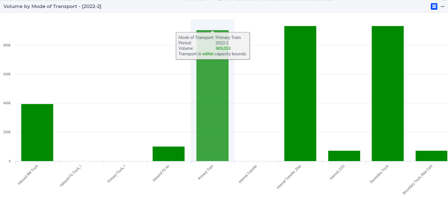
When hovering over one the columns in the bar chart a tooltip with more information appears for that column:
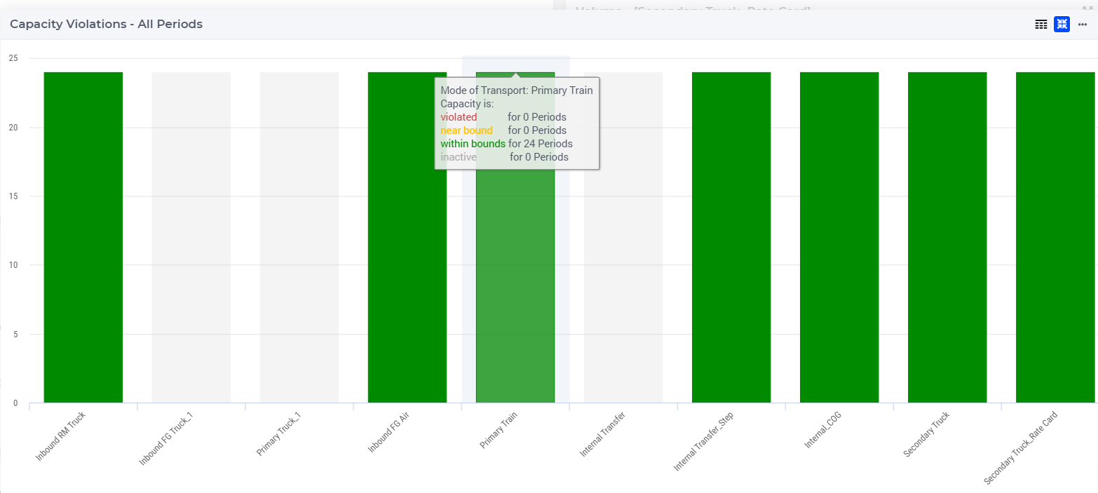
When clicking on one of the transport modes on the bar chart, the data for the selected transport mode appears in the Volume bar chart.
You can display the legend by clicking on the  icon on the upper right corner of the widget.
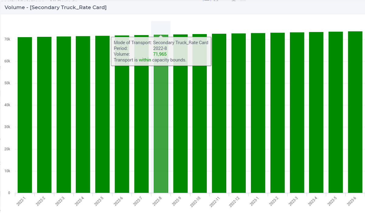
Volume Bar Chart 
This bar chart shows the volume by period for a selected transport mode. You can select a transport mode by clicking on one of the transport modes in the bar charts Capacity Violation or Volume by Transport Mode. You can also select a transport mode by clicking on a lane which belongs to that transport mode on the Capacity Violations map.
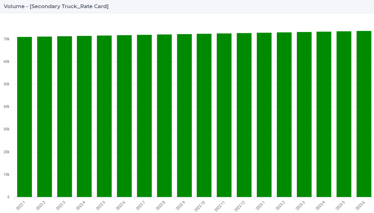
The bar chart is color-coded based on the status of the transport mode, which can be one of the following:
Red (Violated): when the capacity utilization is higher than its limit
Orange (Near bounds): when the capacity utilization is close (above 95%) to its limit
Green (Within bounds): when the capacity utilization is within its limits
Gray (Inactive): when the transport mode is not active
When hovering over one the columns in the bar chart a tooltip with more information appears for that column:
Volume by Mode of Transport Bar Chart 
This bar chart shows the total volume for the selected period for all transport modes. By default, the table shows the data for the first period.
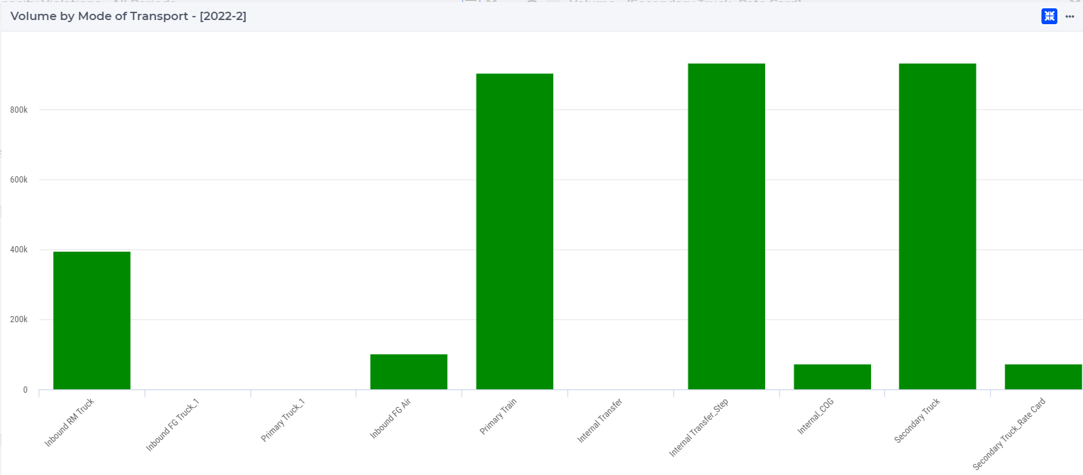
The bar chart is color-coded based on the status of the transport mode, which can be one of the following:
Red (Violated): when the capacity utilization is higher than its limit
Orange (Near bounds): when the capacity utilization is close (above 95%) to its limit
Green (Within bounds): when the capacity utilization is within its limits
Gray (Inactive): when the transport mode is not active
If you select another period, the data in the bar chart will change accordingly.
When hovering over one the columns in the bar chart a tooltip with more information appears for that column:
Transport Capacity Violations Map 
This map presents the optimal flows through the network for the selected period. By default, the table shows data for the first period. The nodes are color-coded based on the their type, similarly to the coloring on the Results page.
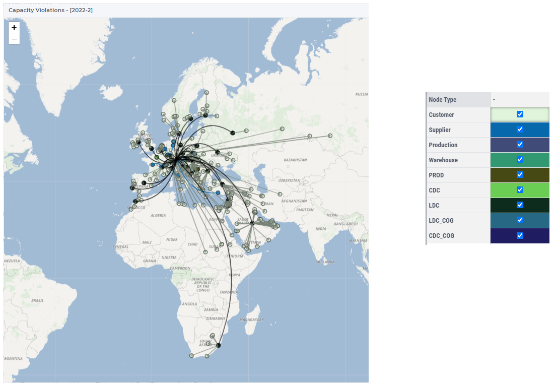
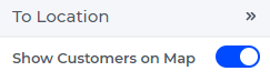
The customer nodes are hidden by default when more than 2500 customer locations are present. To toggle the visibility of customer nodes, navigate to the To Location side panel and click on the Show Customers on Map switch.
The arcs show the different types of transportation lanes, their color and curve are based on their types, as follows:
Primary (curved,blue): flows go from Suppliers and represent “the first mile” flows
Secondary (straight, olive): flows go to Customers and represent “the last mile” flows
InterResource (curved, black): flows go between Resources (Production facilities, Warehouses, etc.)
Direct (straight, olive): flows go directly from a Supplier to a Customer
The size of the arcs depends on the volume.
When clicking on one of the lanes on the map, the data for the transport mode of the selected lane appears in the Volume bar chart.
You can turn on the coloring by service range on the map as follows:
Click on the
icon at the upper right side of the map widget
Click on the Color customer nodes by service range option
The color of the node depends on its category.
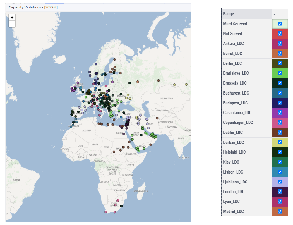
When hovering over one of the lanes on the map, a tooltip with more information appears for that lane:
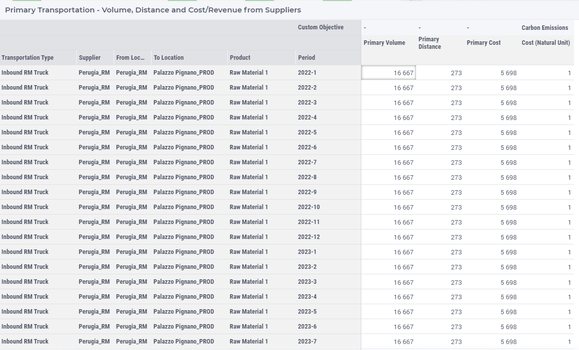
Primary Transportation Table 
The table Primary Transportation shows the results of the primary lanes which go from a supplier location. Primary Number of Trips is calculated based on the Primary Volume and either the Load Size or the Rate Card Drop Size specified for the lane in the template.
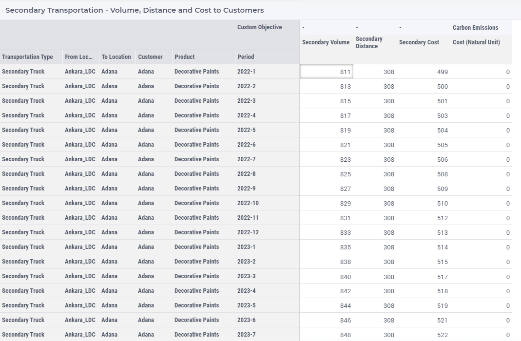
Secondary Transportation Table 
The table Secondary Transportation shows the results of the secondary lanes which go to a customer location. Secondary Number of Trips is calculated based on the Secondary Volume and either the Load Size or the Rate Card Drop Size specified for the lane in the template.
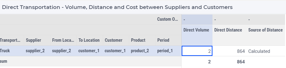
Direct Transportation Table 
The table Direct Transportation shows the results of the lanes which go from supplier to a customer. Direct Number of Trips is calculated based on the Direct Volume and either the Load Size or the Rate Card Drop Size specified for the lane in the template.
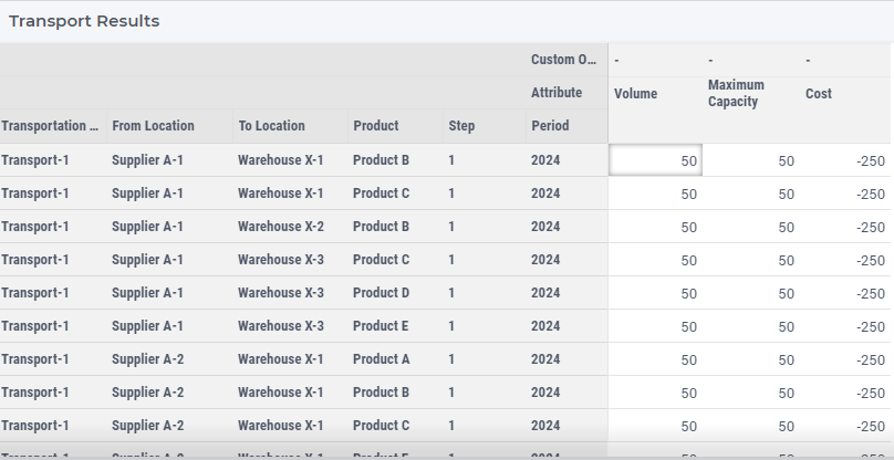
Transport Results Table
The table Transport Results shows the results of all lanes.
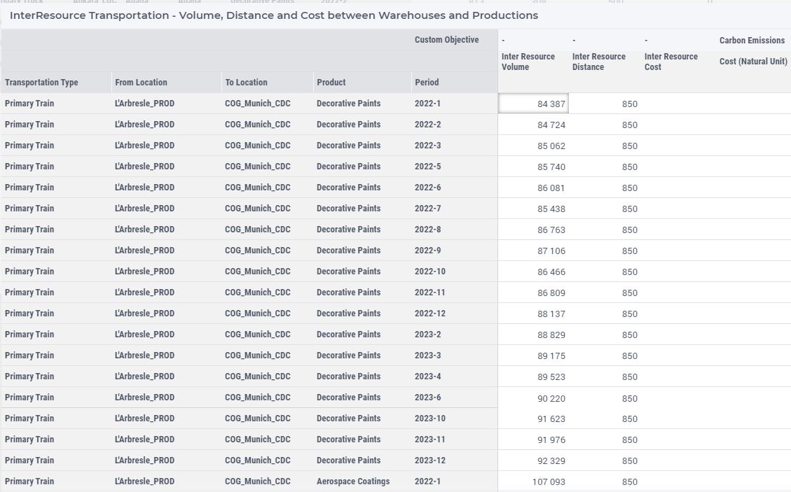
InterResource Transportation Table 
The table InterResource Transportation shows the results of the lanes which go between resources. InterResource Number of Trips is calculated based on the InterResource Volume and either the Load Size or the Rate Card Drop Size specified for the lane in the template.
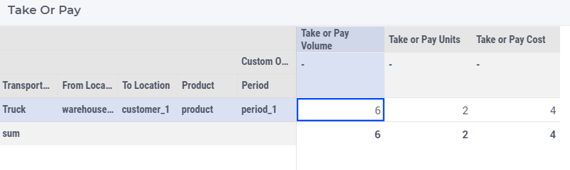
Take or Pay Table 
The table Take or Pay Transportation shows take or pay cost related results. You can read more about Take or Pay Costing in Take Or Pay Volume.
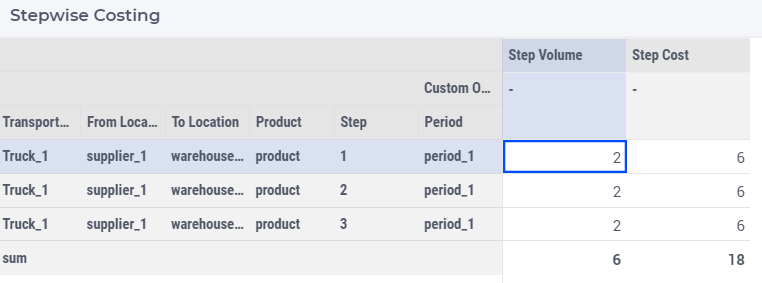
Stepwise Costing Table 
The table Stepwise Costing Table shows the stepwise costing related results. You can read more about Stepwise Costing in Stepwise Transport Cost.