Risk Analysis
This functionality is only available in the Sustainability and Risk Module.
Introduction
The locations in supply chain foot print face various risks of disruptions, such as natural disasters, geopolitical instability, trade wars, cyber attacks, single points of failure, lack of flexibility/adaptability etc. Each potential shutdown represents a distinct risk scenario which must be evaluated.
The Risk Analysis feature automatically simulates closing each facility, one location at a time, to quantify that risk. It plots each scenario on a risk versus impact matrix showing:
X-axis: Likelihood of occurrence based on the probability of adverse events. This is the input data.
Y-axis: Consequence as measured by increased costs or lost revenue percentage. This is the outcome of each scenario.
This matrix generates a visual risk profile for every node (scenario). Supply chain leaders can quickly identify high likelihood and high impact vulnerabilities to prioritize their continuity planning and mitigation efforts.
By creating transparency into the most precarious failure points, the organization can make data-driven decisions about redundancies, inventory buffering, and other resilience strategies. They can concentrate resources on the highest risk facilities to avoid catastrophic disruptions threatening overall operations and customer delivery.
Data Requirements
Data requirements may be fulfilled in two steps:
Input data
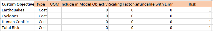
Risk Factors should be added to the sheet Custom Objectives. Assign the Type as Cost (since they negatively impact supply chain) and Risk as 1. The screenshot below gives an example with four risk factors:
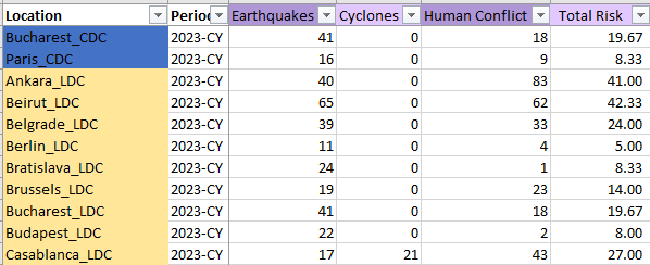
The likelihood or scale of each Risk Factor should be added to the sheet Location Period.
Generate template
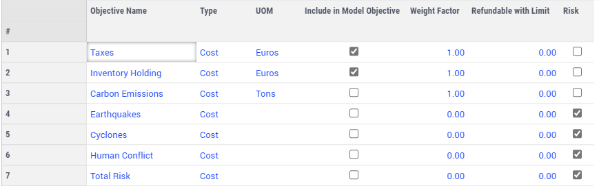
To generate a template with risk factors, you need to input them in the dialog page as Objective Name, assign Type as Cost and select the “Risk” column checkboxes.
Key Features
Setup and Run
If Risk Analysis has not been performed yet, a configuration dialog will automatically appear upon opening this page (or manually by using the bottom right page action “Setup and Run”  ).
).
Choose locations
A run will simulate closing one location at a time. The candidate set can be selected by using the four location widgets for Customers, Suppliers, Production, and Warehouses. You can use groups or individual selection for convenience. These widgets behave identically to filters elsewhere in the application.
Allow opening or closing facilities
The baseline solution may contain both open and closed facilities. By default, scenarios maintain open/closed status unless the location being analyzed is shut down. The settings on the left side provide flexibility to open/close other entities as well.
Risk Analysis Chart
The Risk Analysis Chart has two axis:
X-axis: selected risk factor of each scenario
Y-axis: outcome/impact on selected KPI of each scenario
Both axis can be selected in the Chart Settings area. The drop down list of X-axis includes the risk factors included in this dataset. The drop down list of Y-axis includes the (non-risk) custom objectives, plus: Demand Decrease, Profit Decrease, Total Physical Revenue Decrease, Leadtime Increase, and Total Physical Cost Increase.
Moreover, the Chart Settings provide more options:
Original Solution - Selected Y-axis: the value of the baseline scenario solution
Show Infeasible Scenarios: When closing a location is not feasible, this scenario will appear as a red dot. By default this is switched on.
Show locations closed in the original solution: In the baseline scenario, a warehouse location may be closed, or a customer location’s demand was not fulfilled. A scenario like that will keep the corresponding location closed and also the original solution. This dot will appear as a gray dot. By default this is switched off.
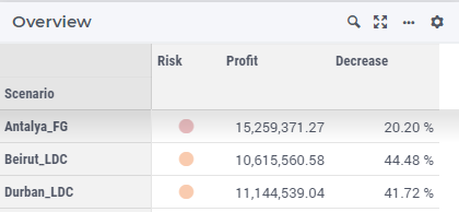
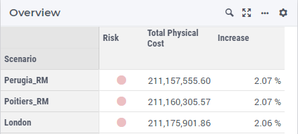
Overview of Risks
This table displays the risk level, the value of selected Y-axis value and the corresponding decreased/increased percentage compared with the baseline.
Each scenario is displayed as a dot in one of the seven colors:
Red dot
: This scenario is infeasible. This is an alert indicating that this is a critical entity.
Risk Level 4
(Highest risk)
Risk Level 3
Risk Level 2
Risk Level 1
(Lowest risk)
Green dot: This scenario brings higher revenue or lower cost, which could be an improvement compared with the baseline scenario.
Gray dot: This location is already closed in the baseline solution. This has no impact compared with the baseline.

Note
When you hover over the empty space before the dot, a tooltip indicating the level of that dot will show up.
The headers of the other two columns update as you select different Y-axis. Below are two examples which have “Profit Decrease” and “Total Physical Cost Increase” selected, respectively.
Load a Results Dataset
To investigate the details of a scenario, you can right-click a dot and select Load in order to load the complete results for that scenario.
Methodology
The risk level of a scenario is calculated by its value on the two axes:
X-axis value: the risk factor or probability of each scenario
Y-axis value: the impact on the selected KPI
Impact Calculation:
For Cost type KPIs: (Scenario Cost - Baseline Cost) / Baseline Cost
For Revenue type KPIs: (Baseline Revenue - Scenario Revenue) / Baseline Revenue
Positive Impact
The scenario has higher cost or lower revenue.
Negative Impact
The scenario has lower cost or higher revenue.
Risk Level Mapping:
When the impact is positive, the supply chain is exposed to a certain level of risk. This risk is categorized into four levels. The risk level is determined by its (total) relative position in X-axis and Y-axis as follows:
(X value / Max X value) + (Y value / Max Y value).
Risk Level 4: >= 1.5 (Highest risk)
Risk Level 3: >= 1
Risk Level 2: >= 0.5
Risk Level 1: < 0.5 (Lowest risk)
An illustration representing all possible dots and their levels is shown below: