Production Results
After the optimization has been completed you can analyze the results using various tables, bar charts and maps. On this page you can find reports of the results related to the Production category, such as:
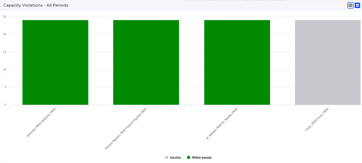
Production Capacity Violation Bar Chart 
This bar chart shows the capacity violation for all periods and for all production facilities. The name of the production facility is shown on the x-axis and the number of periods is shown on the y-axis.
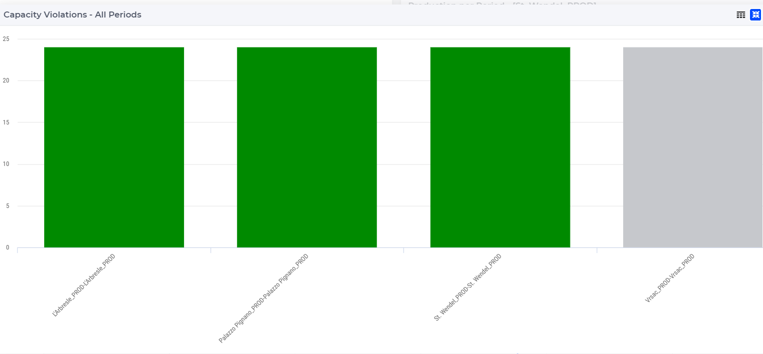
The bar chart is color-coded based on the status of the production facility, which can be one of the following:
Red (Violated): when the capacity utilization is higher than its limit
Orange (Near bounds): when the capacity utilization is close (above 95%) to its limit
Green (Within bounds): when the capacity utilization is within its limits
Gray (Inactive): when the production facility is not active
When hovering over one the columns in the bar chart a tooltip with more information appears for that column:
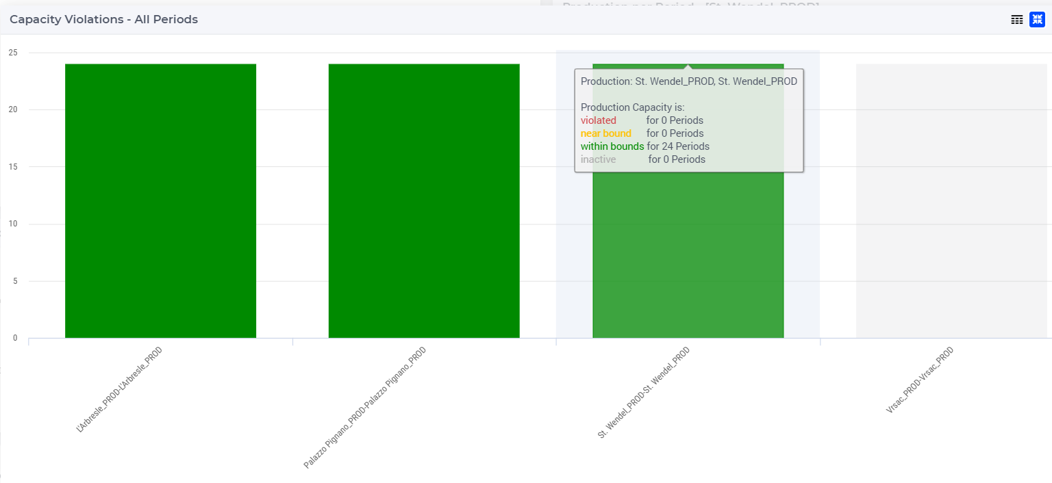
When clicking on one of the production facilities on the bar chart, the data for the selected production facility appears in the bar chart Production Per Period and the node of the selected production facility gets a black outline on the Capacity Violation map. In the tables Production Usage, Production Usage by Bill of Material, and Bill of Material Input Output, the rows which belong to the selected production facility are highlighted.
You can display the legend by clicking on the  icon on the upper right corner of the widget.
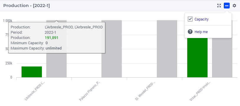
Production Per Period Bar Chart 
This bar chart shows the production per period for a selected production facility. You can select a production facility by clicking on one of the production facilities in the bar charts Capacity Violation-All Periodes or Production. You can also select a production facility by clicking on it on the Capacity Violation map.
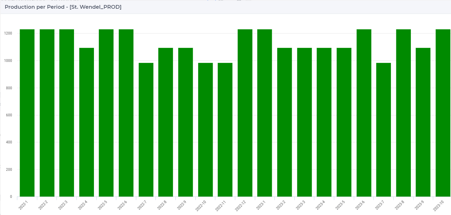
The bar chart is color-coded based on the status of the production facility, which can be one of the following:
Red (Violated): when the capacity utilization is higher than its limit
Orange (Near bounds): when the capacity utilization is close (above 95%) to its limit
Green (Within bounds): when the capacity utilization is within its limits
Gray (Inactive): when the production facility is not active
When hovering over one the columns in the bar chart a tooltip with more information appears for that column:
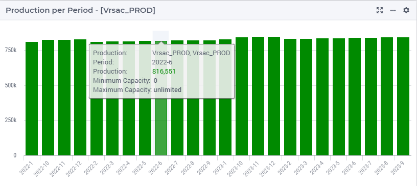
This chart can also display the production capacity and production product capacity beside the production volume, allowing for a direct comparison between the two metrics. You can toggle on or off the capacity display by the widget action in top right corner.
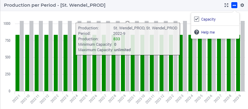
Note that the tooltip of the production capacity shows the corresponding maximum capacity and minimum capacity.
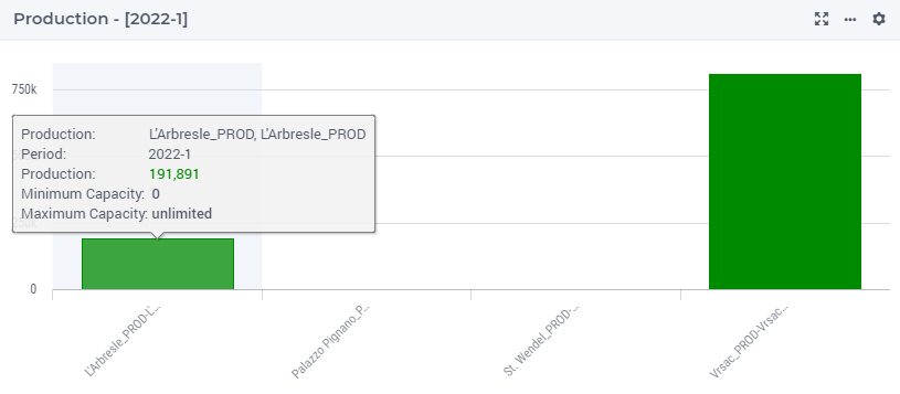
Production Single Period Bar Chart 
This bar chart shows the total production for a selected period for all production facilities. By default, the table shows data for the first period.
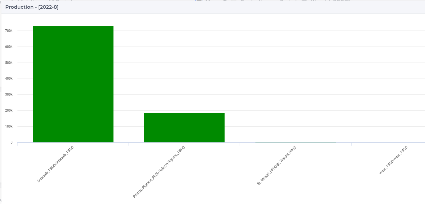
The bar chart is color-coded based on the status of the production facility, which can be one of the following:
Red (Violated): when the capacity utilization is higher than its limit
Orange (Near bounds): when the capacity utilization is close (above 95%) to its limit
Green (Within bounds): when the capacity utilization is within its limits
Gray (Inactive): when the production facility is not active
If you select another period, the data in the bar chart will change accordingly.
When hovering over one the columns in the bar chart a tooltip with more information appears for that column:
This chart can also display the production capacity and production product capacity beside the production volume, allowing for a direct comparison between the two metrics. You can toggle on or off the capacity display by the widget action in top right corner.
Note that the tooltip of the production capacity shows the corresponding maximum capacity and minimum capacity.
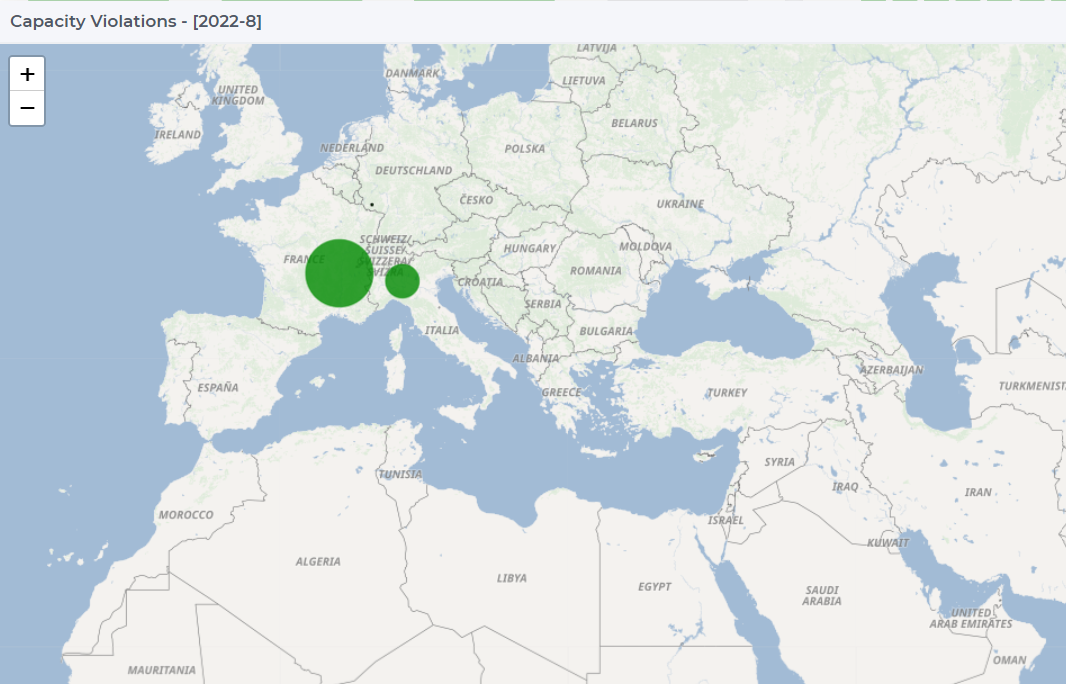
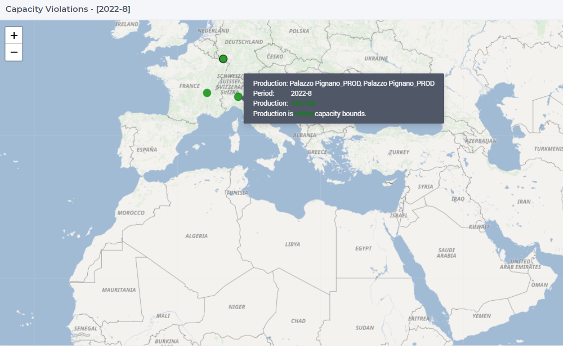
Production Capacity Violation Map 
This map presents all production facilities in the model for a selected period. By default, the table shows data for the first period.
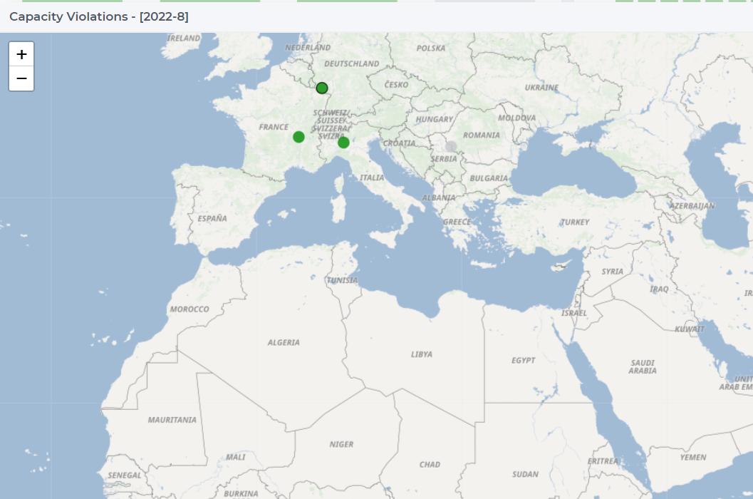
The nodes are color-coded based on the status of the production facility, which can be one of the following:
Red (Violated): when the capacity utilization is higher than its limit
Orange (Near bounds): when the capacity utilization is close (above 95%) to its limit
Green (Within bounds): when the capacity utilization is within its limits
Gray (Inactive): when the production facility is not active
When clicking on one of the production facilities on the map, the data for the selected production facility appears in the bar chart Production Per Period. The node of the selected production facility gets a black outline.
You can resize the dots on the map as follows:
Click on the menu icon
for widget actions in the upper right corner of the map widget
Click on the Resize dots by volume option
The higher the volume of the production facility, the larger its dot drawn on the map
When hovering over one of the production facility nodes a tooltip with more information appears for that node:
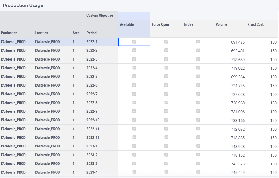
Production Usage Table 
The table Production Usage shows the production facility related results.
Note
In use: This indicates whether the production facility is active in the given period.
The volume column is color-coded on the status of the production facility, namely:
Red (Violated): when the capacity utilization is higher than its limit
Orange (Near bounds): when the capacity utilization is close (above 95%) to its limit
Green (Within bounds): when the capacity utilization is within its limits
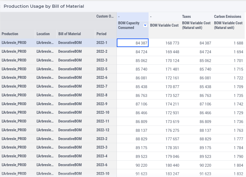
Production Usage by Bill of Material Table 
The table Production Usage by Bill of Material shows the results related to the production facility and the product.
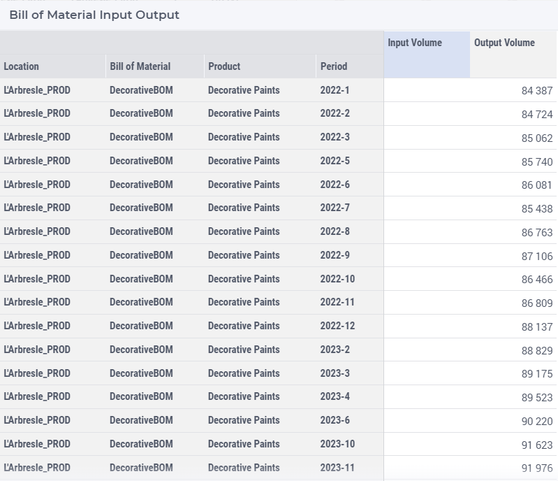
Bill of Material Input Output Table 
The table Bill of Material Input Output shows the input and the output volume of products for each production facility location.