Warehouse Results
After the optimization has been completed you can analyze the results using various tables, bar charts and maps. On this page you can find reports of the results related to the Warehouse category, such as:
You can read about the period selector in Period Selector.
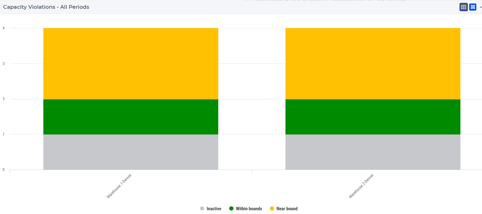
Warehouse Capacity Violation Bar Chart 
This bar chart shows the capacity violation for all periods and for all warehouses. The name of the warehouse is shown on the x-axis and the number of periods is shown on the y-axis.
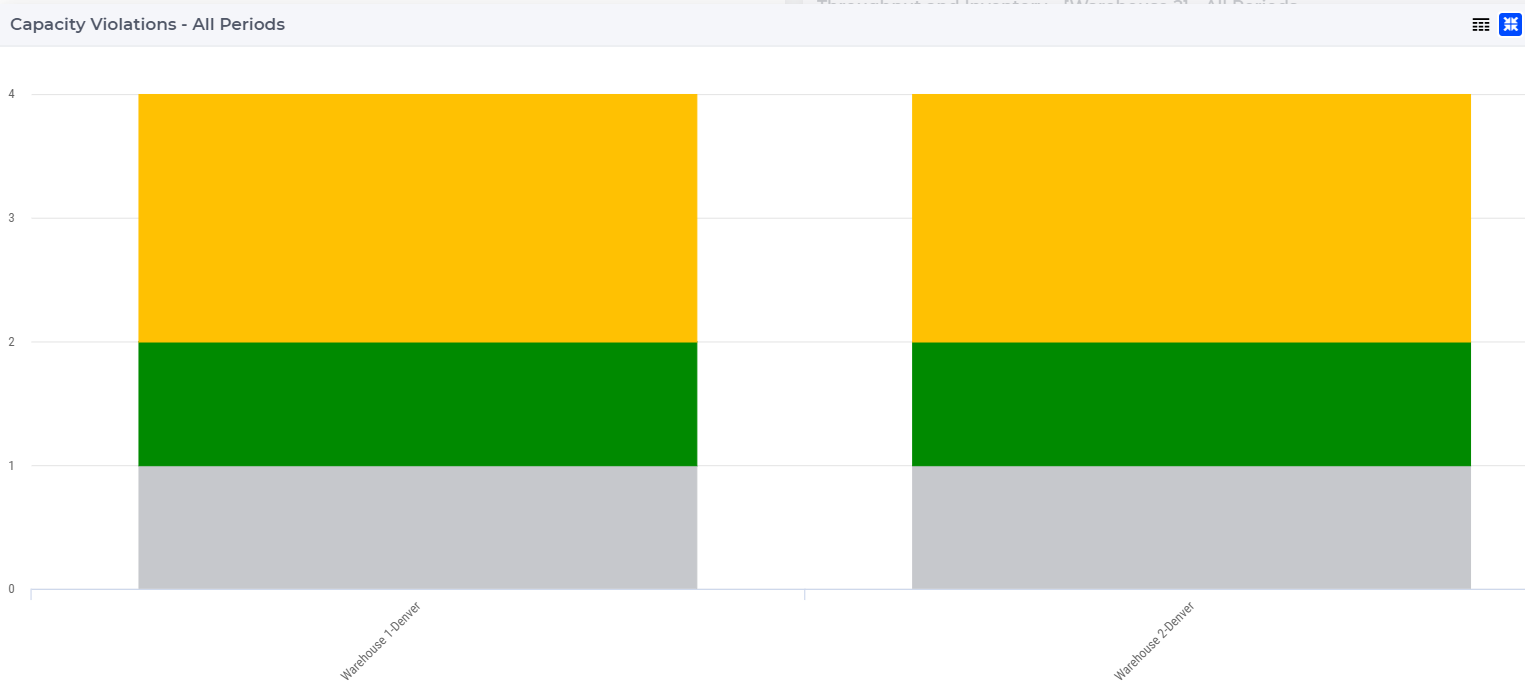
The bar chart is color-coded based on the status of the warehouse, which can be one of the following:
Red (Violated): when the capacity utilization is higher than its limit
Orange (Near bounds): when the capacity utilization is close (above 95%) to its limit
Green (Within bounds): when the capacity utilization is within its limits
Gray (Inactive): when the warehouse is not active
When hovering over one the columns or scatters in the bar chart, a tooltip with more information appears for that column:
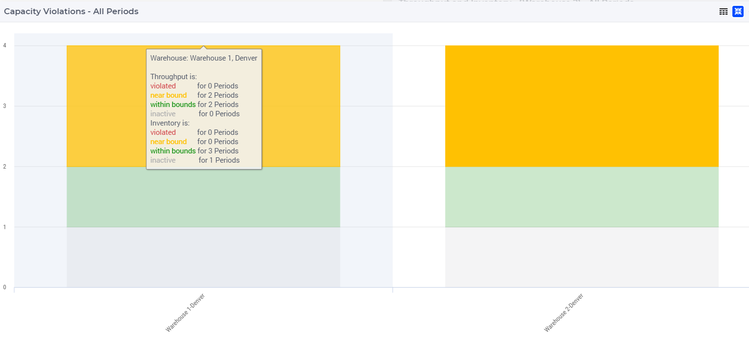
When clicking on one of the warehouses in the bar chart, the data for the selected warehouse appears in the Throughput and Inventory- All Periodes bar chart and the node of the warehouse gets a black outline on the Capacity Violations map. Furthermore, the rows which belong to the selected warehouse are highlighted in the tables Warehouse Throughput Usage and Warehouse Throughput Usage by Product.
You can display the legend by clicking on the  icon on the upper right corner of the widget.
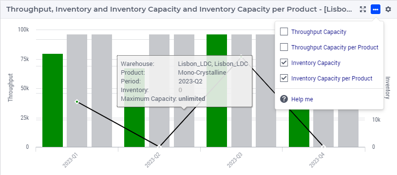
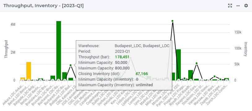
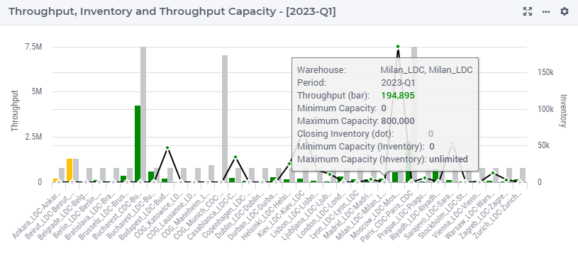
Throughput and Inventory - All Periods Bar Chart 
This bar chart shows the throughput and the inventory levels for a selected warehouse for all periods. The period is shown on the x-axis and the throughput and inventory data are shown on the y-axis. The throughput data are shown as bars and the inventory data are shown as line and scatter. You can select a warehouse by clicking on one of the warehouses in the bar charts Capacity Violation-All Periods or Throughput and Inventory. You can also select a warehouse by clicking on it on the Capacity Violations map.
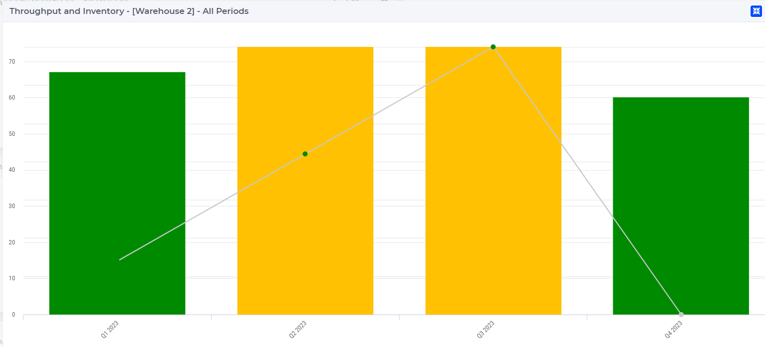
The bar chart is color-coded based on the status of the warehouse, which can be one of the following:
Red (Violated): when the capacity utilization is higher than its limit
Orange (Near bounds): when the capacity utilization is close (above 95%) to its limit
Green (Within bounds): when the capacity utilization is within its limits
Gray (Inactive): when the warehouse is not active
When hovering over one the columns (or scatters) in the bar chart, a tooltip with more information appears for that column (or scatter):
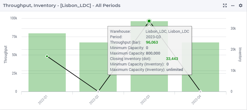
The tooltip shows a variety of information:
The warehouse, location, period currently viewing
Throughput volume in bar
Throughput maximum capacity
Throughput minimum capacity
Inventory level in dot
Inventory maximum capacity
Inventory minimum capacity
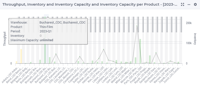
This chart can also display the warehouse capacity and warehouse product capacity beside the volume, allowing for a direct comparison among the metrics. You can toggle on or off the capacity display by the widget action in top right corner.
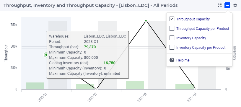
Note that the tooltip of the warehouse capacity shows the corresponding maximum capacity and minimum capacity.
When showing warehouse product capacity, the capacity bar stacks up all related products vertically, and the tooltip shows the maximum capacity and the throughput/inventory of the corresponding product. Minimum capacity is not displayed here.
Throughput and Inventory Single Period Bar Chart 
This bar chart shows the total throughput and inventory for the selected period for all warehouses. By default, the table shows the data for the first period. If you select another period, the data in the bar chart will change accordingly.
The name of the warehouse is shown on the x-axis and the throughput and inventory data are shown on the y-axis. The throughput data is shown as bars and the inventory data is shown as scatter.
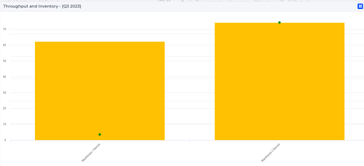
The bar chart is color-coded based on the status of the warehouse, which can be one of the following:
Red (Violated): when the capacity utilization is higher than its limit
Orange (Near bounds): when the capacity utilization is close (above 95%) to its limit
Green (Within bounds): when the capacity utilization is within its limits
Gray (Inactive): when the warehouse is not active
When hovering over one the columns (or scatters) in the bar chart, a tooltip with more information appears for that column (or scatter):
The tooltip shows a variety of information:
The warehouse, location, period currently viewing
Throughput volume in bar
Throughput maximum capacity
Throughput minimum capacity
Inventory level in dot
Inventory maximum capacity
Inventory minimum capacity
This chart can also display the warehouse capacity and warehouse product capacity beside the volume, allowing for a direct comparison among the metrics. You can toggle on or off the capacity display by the widget action in top right corner.
Note that the tooltip of the warehouse capacity shows the corresponding maximum capacity and minimum capacity.
When showing warehouse product capacity, the capacity bar stacks up all related products vertically, and the tooltip shows the maximum capacity and the throughput/inventory of the corresponding product. Minimum capacity is not displayed here.
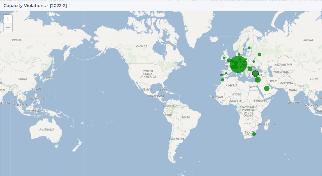
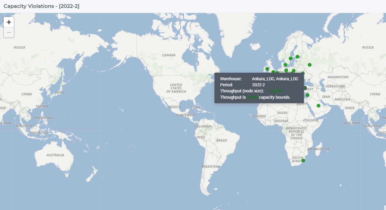
Warehouse Capacity Violations Map 
This map presents all the warehouses in the model for the selected period. By default, the table shows the data for the first period.
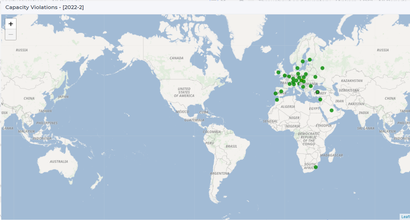
The nodes are color-coded based on the status of the warehouse, which can be one of the following:
Red (Violated): when the capacity utilization is higher than its limit
Orange (Near bounds): when the capacity utilization is close (above 95%) to its limit
Green (Within bounds): when the capacity utilization is within its limits
Black (Inactive): when the warehouse is not active
When clicking on one of the warehouses on the map, the data for the selected warehouse appears in the bar chart Throughput and Inventory. The node of the selected warehouse gets a black outline on the map.
You can resize the dots on the map as follows:
Click on the menu icon
for widget actions at the upper right side of the map widget
Click on the Resize dots by volume option
The higher the volume of the warehouse, the larger its dot drawn on the map
When hovering over one of the warehouse nodes, a tooltip with more information appears for that node:
Warehouse Throughput Usage Table 
The table Warehouse Throughput Usage shows results related to the warehouse throughput.
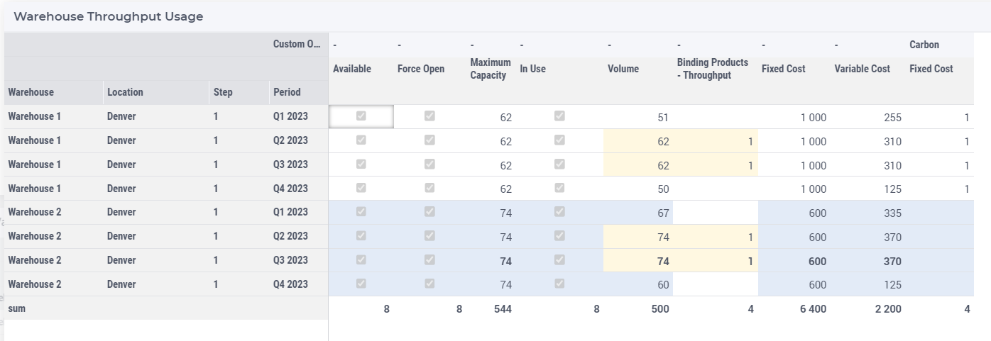
Note
In use: This indicates whether the warehouse is active in the given period.
Binding products: This is the number of the products for which the volume is higher/lower than the limits or near the limits.
The volume column is color-coded based on the status of the warehouse:
Red (Violated): when the capacity utilization is higher than its limit
Orange (Near bounds): when the capacity utilization is close (above 95%) to its limit
Green (Within bounds): when the capacity utilization is within its limits
The rows which belong to the selected warehouse are highlighted in the table.
Warehouse Throughput Usage by Product Table 
The table Warehouse Throughput Usage by Product shows the warehouse and product throughput results.
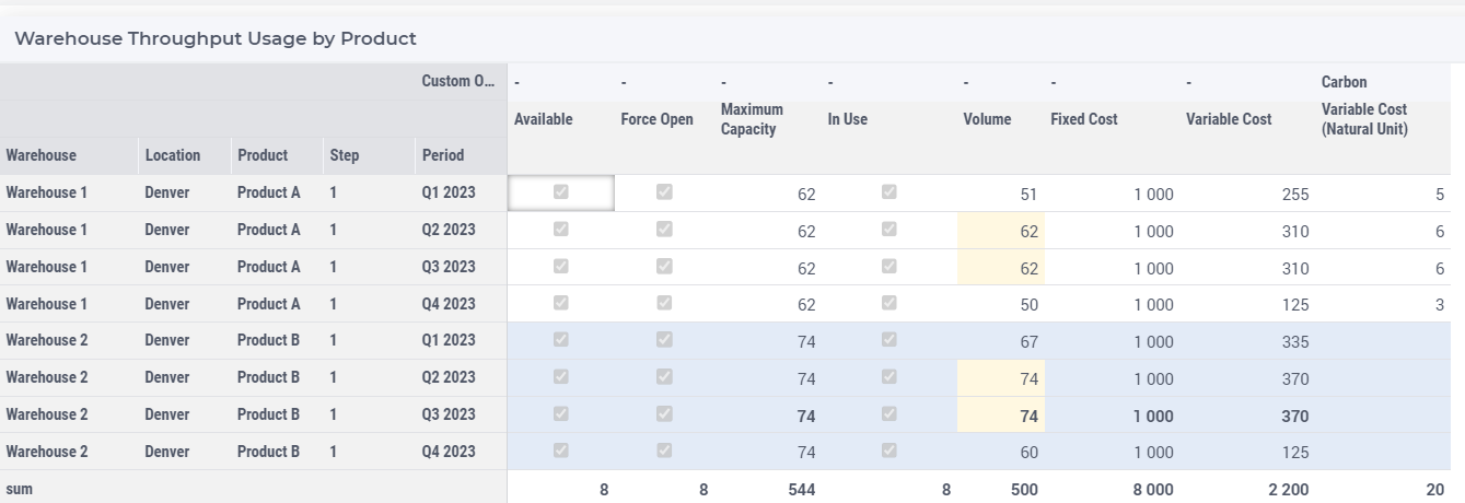
The rows which belong to the selected warehouse are highlighted in the table.
Note
When there is “Inventory Available” in the dataset, the “Volume” column will be come separate columns as Inbound and Outbound.
Warehouse Inventory Usage Table 
The table Warehouse Inventory Usage shows the warehouse inventory related results.
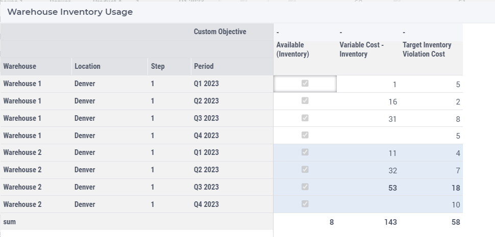
The rows which belong to the selected warehouse are highlighted in the table.
Warehouse Inventory Usage by Product Table 
The table Warehouse Inventory Usage by Product shows the warehouse and product inventory results.
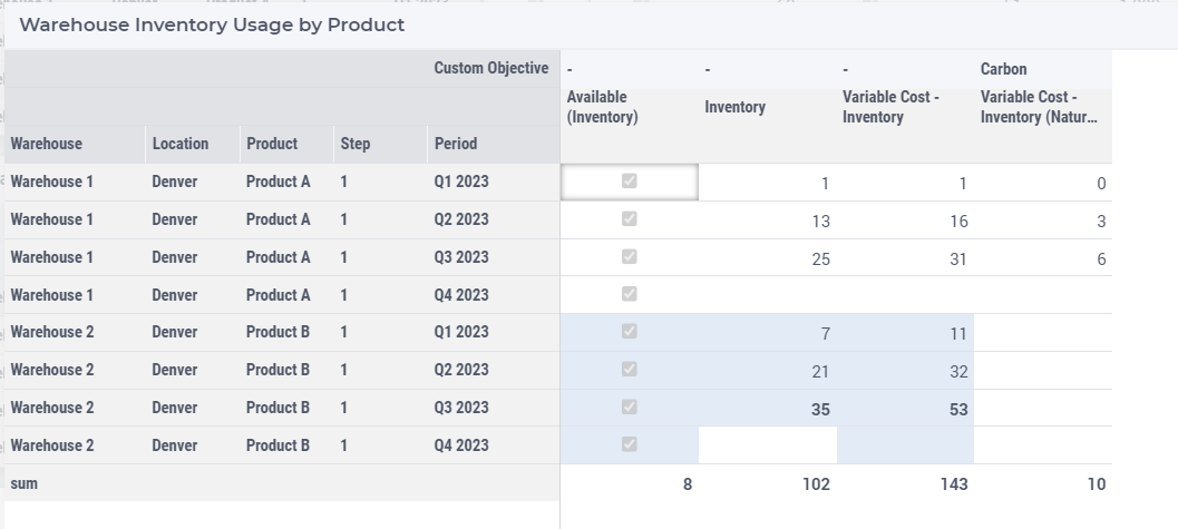
The rows which belong to the selected warehouse are highlighted in the table.